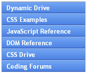
Dynamic Drive CSS Library provides a good listing of vertical menu options. i like their spacing on the menus, which is just right to enclose the clear text.
some things to note and provide are
- indicate which menu option has been selected. google indicates this in a nice way..

- when there aren't many options and there is space, it is better to layout all the options. expand/collapse menu's are cool.. but not needed..


No comments:
Post a Comment